
When looking for a job, you will get advice like structuring the work experience section or writing a personal profile. There are many things to consider when creating a CV. One of the most important things many overlook is the font choice. There are thousands of fonts, so you may get confused about which is the best font for CV in the UK. Here is a comprehensive guide explaining the best font to help you make an excellent first impression.
Key Takeaways on the Best Font for CV
- Arial and Calibri are the safest choices for the best font for CV in the UK; they are clean, professional, and pass ATS scanning every time.
- Use 11pt for the body, 12-14pt for headings, and 18-22pt for your name, never drop below 10.5pt.
- Avoid Comic Sans, Papyrus, and other decorative fonts; they look unprofessional and can break ATS character parsing.
- Match your font to your industry, serif fonts like Garamond suit law and academia; sans-serif fonts like Lato work better in tech and creative roles.
- You can use two fonts on a CV (font pairing), but never more than one, one for headings, one for body text, and always keep them consistent.
Which Font Is Best for CV in the UK?
Below are some of the best font for CV UK in 2026. Each one is clean, legible, and ATS-friendly, making them safe choices for all industries.
Arial

This is one of the popular sans-serif fonts that gives a modern look to the CV. This font is considered a modest and aesthetically pleasing one. It is a simple, no-frills font, easy to read, and also keeps the document looking clear and crisp. Arial is suitable for various industries, from hospitality to marketing, and even for Self-employed CV.
Arial remains the top recommendation of many UK recruitment agencies in 2026. It is also one of the most ATS-friendly fonts for a CV, as its clean letterforms parse reliably through applicant tracking systems.
Calibri

Calibri has become popular and the best CV font with high legibility. The spacing of the letters makes this font preferable for the CV’s detailed explanation. This font is a good choice if you have to include a lot of information without making it look overcrowded while writing a CV.
Calibri is the standard font for CVs in Microsoft Word and works well as a professional font for CVs across corporate and communications roles. It gives a softer, more modern feel compared to Arial.
Cambria

Are you struggling to squeeze all the CV sections into one or two pages? Cambria might be the best solution. Although the font was designed for on-screen reading, it is clear and easy to read in smaller sizes. It is often considered a slightly less formal version of Times New Roman, one of the most popular fonts in business documents.
Cambria is an ATS-friendly font for a CV and works especially well in finance and business sectors where a traditional, formal tone is valued.
Garamond

professional fonts you can use on your CV. Many describe this font as timeless. Garamond is a popular font among academics and creatives.
For academic CVs, Garamond is one of the best serif fonts alongside Times New Roman and Cambria. It conveys formality and is widely preferred by universities and research institutions.
Georgia
Georgia is an alternative to Times New Roman, as they are similar. This easy-to-read font is a fusion of modern and classic styles. When reading on a screen, this font is good for a CV. This font is quite popular among writers and editors, mostly used in magazines and newspapers.
Georgia is a strong pick for editorial, media, and content roles. It is fully ATS-safe and renders clearly in both digital and printed CVs.
Lato
You can find this font in the Google font library, though it is not a standard option on Microsoft Word. The Lato font of choice can be perfect for innovative industries, but can verge on the side of casual for more traditional sectors. It gives an elegant and professional look that helps you to create an attractive CV that hiring managers enjoy reading.
Lato is growing in popularity as a professional CV font for tech, start-ups, and creative industries in the UK. It is ATS-compatible when embedded correctly.
Trebuchet
This is a good, impactful font that easily captures readers’ attention. It is known for wider letters that make it readable on lower-resolution screens. If you are looking to stand out with a lesser-used font, Trebuchet can be a different choice. Trebuchet has been optimised for digital and print use, making it a great font for CVs and cover letters.
Trebuchet performs well for design, marketing, and digital roles. However, it is worth noting that some older ATS versions may not parse Trebuchet as cleanly as Arial or Calibri, so use it cautiously for highly automated hiring pipelines.
Verdana
Verdana is another modern font that makes on-screen reading easy. It has wide spacing that makes this font remain legible even if you format it to a tiny size. It is considered to be a professional font. Don’t forget to maintain the UK CV format. Many say that this font is similar to Helvetica or Arial.
Verdana is an excellent font style for CV in digital and IT roles due to its wide spacing and screen-first design. It is a fully ATS-safe choice.
Helvetica

According to Type.co.uk, Helvetica is the UK’s most widely used typeface and is featured in many international logos and branding campaigns. Its rounded shapes and straight lines make the CV and cover letter look neat. This font is a great choice for marketing, business, or sales.
Helvetica is a top-tier professional font for a CV in business and sales roles. Note that it is primarily available on Mac and may need to be substituted with Arial on Windows-based systems.
Times New Roman
Times New Roman is another common and well-known serif font used in the CV. Its classic-looking serifs create a formal, traditional look. This font is good for candidates in careers like medicine, law, business, or civil service.
Comparison of the Best Font for CV in the UK
Use this quick-reference table to choose the right font for your executive CV based on your industry, ATS compatibility, and the platform you are writing on:
| Font Name | Type | ATS-Friendly | Best For | Available In |
| Arial | Sans-serif | Yes | All industries | Word, Docs, Web |
| Calibri | Sans-serif | Yes | Corporate, Comms | Word, Docs |
| Cambria | Serif | Yes | Business, Finance | Word, Docs |
| Garamond | Serif | Yes | Academic, Creative | Word, Docs |
| Georgia | Serif | Yes | Editorial, Media | Word, Docs, Web |
| Lato | Sans-serif | Yes | Tech, Creative | Google Docs, Web |
| Trebuchet MS | Sans-serif | Mostly | Design, Marketing | Word, Docs, Web |
| Verdana | Sans-serif | Yes | Digital roles, IT | Word, Docs, Web |
| Helvetica | Sans-serif | Yes | Business, Sales, Marketing | Mac/Word |
| Times New Roman | Serif | Yes | Law, Medicine, Civil Service | Word, Docs, Web |
Best CV Font Size in the UK (Body, Headings & Name)
What Size Font Should a CV Be?
Main body
When people ask, ‘What size font should a CV be?’ 11pt is the sweet spot. It fits more content than 12pt while remaining easy to read without straining the recruiter’s eyes.Headings
CV headings should stand out from the main body. It will allow recruiters to identify sections of interest easily. A CV created by professional career services has distinct headings and increases the font size by one or two points from the main body. For instance, if the default font size for a CV is 11, the heading can be 12 or 14.Name
Recruiters should notice your name immediately. An 18 to 22 font size is suggested, as it ensures that the name is clear in the CV.Stylisation
As mentioned, the section title and header are important in the CV as they indicate important things like work experience and key skills. To distinguish the sections, make them visually unique by bolding the title, capitalising the title, or using another font from the same family. Crafting the perfect CV can be daunting, so take experts’ help to ensure the CV is error-free.How to Format CV Fonts: Bold, Italic & Font Pairing
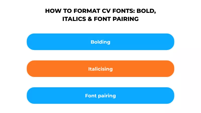
If you want to know how to format the fonts to make your CV more readable, here are some tips you can follow:
Bolding
Bold is a great way to make the most important information stand out, as it makes the text appear heavier and darker. However, do not overuse it, as it can lose its impact. Save it for the most important information, like your name and job title, and in the work experience section.
Italicising
This makes the font look slanted to the right. It is based on old-fashioned calligraphic handwriting. Using italicising is the best way to emphasise small chunks of text. Use it more sparingly than bolding. The perfect place to use it is for the name and location of the employer in the work history.
Font pairing
Did you know you can use two types of fonts in the CV? This is called font pairing, and most graphic designers use this trick. The key is to use fonts that complement each other. For example, pair a serif and a sans-serif font to create a balance. Use one font in your name and section headings and another in the body text.
A common font pairing for CVs is Georgia (headings) + Arial (body) or Garamond (headings) + Calibri (body). Never use more than two fonts; it looks cluttered and can confuse ATS parsers.
Things not to use
Underlining
Underlining the text in the CV looks messy and cluttered on the page. The best font for CV should maximise clarity and white space.
Highlighting
If you are writing notes, highlighting the text is fine. But this is not a good option for the CV, as it looks messy and distracting.
Capitalising
This can work for the section headings, but do not use it anywhere else; otherwise, it might look like you are shouting.
ATS and CV Fonts: Which Fonts Pass Applicant Tracking Systems?
Before your CV reaches a recruiter’s desk, it almost always passes through an Applicant Tracking System (ATS). ATS makes it easy to scan your CV for keywords, job titles, and skills, and the font you choose directly affects how well it can read your document.
ATS software works by converting CV text into machine-readable characters. Highly stylised, decorative, or thin fonts can cause character substitution errors, meaning your keywords get garbled or missed entirely. This is why choosing the best CV writing service is not just about aesthetics; it is about making sure your application actually gets read.
Which Font Is Most ATS friendly for a CV?
The safest ATS-friendly fonts for a CV are:
- Arial
- Calibri
- Helvetica
- Georgia
- Cambria
- Garamond
- Verdana
- Times New Roman
These ATS friendly font for CV are widely installed across all platforms and use standard character encoding that ATS systems can parse cleanly.
Fonts to avoid in ATS contexts include Trebuchet MS (some older systems struggle with it), decorative script fonts, narrow/condensed fonts, and any custom or downloaded fonts not natively installed on Windows or Mac. If a font requires a separate download, do not use it on a CV you are submitting through an ATS.
A simple rule: if you are applying through an online portal or jobs board, stick to Arial or Calibri. If you are sending your CV directly to a recruiter by email, you have a little more flexibility with font style for CV, but professional and clean always wins.
Which Fonts Should be Avoided for a CV in the UK?
Knowing what fonts to avoid on a CV is just as important as knowing which ones to use. These fonts either break ATS parsing, look unprofessional, or reduce readability:

As a rule of thumb: if a font would look at home on a party invitation, it does not belong on your CV.
How to Choose the Best Font for Your CV?
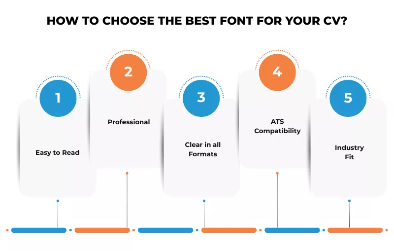
Here are a few things to consider when choosing the best font for CV.
Easy to Read
Try to keep the font simple. It makes a good impression and also increases readability. Simple and clean fonts are safe and considered professional.
Professional
Professionalism can be subjective depending on the specific industry. If you are applying to the creative industry, using a creative font might be acceptable. So, research the type of fonts used in the industry you are applying to. It can give you a good idea of the best fonts to use.
Clear in all Formats
Formatting your CV includes sizing and stylistic choices, such as making some words italic or bold. Sometimes, a font is more readable when it appears in normal, non-italic, or non-bold form. Make sure the readability is the same after formatting.
If you are struggling to create a CV for yourself, contact the CV editing service.
ATS Compatibility
Always check whether your chosen font passes ATS scanning. If it is harder to read, then avoid it. Stick to widely-installed fonts and avoid anything that requires a custom download or plugin. When in doubt, Arial and Calibri are your safest options.
Industry Fit
Your font choice should match the culture of the sector you are targeting. A serif font like Garamond signals authority in law or academia. A clean sans-serif like Lato or Calibri feels right at home in tech or marketing. If you are struggling to create your CV, contact the CV editing service for expert support.
Best Font for Your CV by Industry
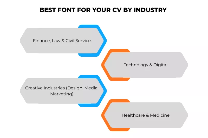
The best font for a CV is not one-size-fits-all. Different industries have different expectations, and matching your font to the culture of your target sector gives your CV a subtle but powerful edge:
Finance, Law & Civil Service
These sectors value formality and precision. Use serif fonts like Garamond, Cambria, or Times New Roman at 11-12pt. These signal professionalism and attention to detail, qualities hiring managers in these fields actively look for.
Technology & Digital
Modern sans-serif fonts work best here. Lato, Verdana, or Calibri project a clean, forward-thinking image. Avoid anything too traditional; a recruiter at a SaaS company will notice an overly formal font.
Creative Industries (Design, Media, Marketing)
You have a little more room to express personality. Trebuchet MS, Lato, or Georgia can work well, but always prioritise readability. If your CV goes through an ATS, stick to an ATS-safe font even in creative roles.
Healthcare & Medicine
Medical CVs should convey precision and trust. Times New Roman or Cambria at 11pt is the standard. Avoid anything that looks too casual or experimental; font choice here reflects professionalism.
Extra Tips When Choosing the Best Font Styles and Formats
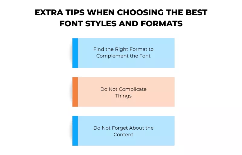
Find the Right Format to Complement the Font
If you use a traditional reverse chronological structure, stick to the serif font, indicating professionalism. If you have opted for a creative CV template, sans-serif fonts are best as they are fun and informal. Consider the industry you are applying for; sectors like law and finance prefer formal typeface, while some give more leeway.
Do Not Complicate Things
Remember, simplicity is the key to a CV. Try to stick to the recruiter-recommended typefaces like Arial, Calibri, and Times New Roman instead of complicating things. Ensure the content is engaging, try formatting tools, and add positive adjectives and action verbs.
Do Not Forget About the Content
Do not get distracted by fonts and forget about creating interesting sections. Explain why you are the best candidate for the job. You can check the CV examples on our website.
Get Success with Our CV Writing Service
Are you unable to compose your CV and need professional help? iCover offers the best CV and cover letter writing service. It is important to understand what attracts hiring managers. We have a professional team that makes your CV stand out, and that chooses the best font for your CV and supports you from beginning to end. The CV writers highlight the key skills that attract the recruiter’s attention. Connect with our experts and try our CV builder.
Frequently Asked Questions
What is the most professional font for a CV?
The most professional fonts for a CV in the UK in 2026 are Arial, Calibri, and Garamond. Arial is the most versatile, ATS-friendly font and is most widely used by UK hiring managers. Times New Roman is ATS-friendly but may appear old-fashioned for creative jobs. Garamond is a good choice for a contemporary and senior look.
Which fonts should be avoided for a CV in the UK?
Don’t use decorative fonts like Comic Sans, Papyrus, Brush Script, Impact, Lucida Handwriting, and Courier New. These either hinder ATS CV scanning, are unprofessional, or are difficult to read at small sizes. If you think a font would look good on a wedding invitation, it shouldn’t be used in a CV.
What font is used for academic CVs?
In the UK, academic CVs use traditional serif fonts such as Garamond, Times New Roman, or Cambria, at a point size of 11-12pt. Universities, research institutes, and journals like serif fonts as they look formal. Don’t use sans-serif fonts such as Calibri for publication lists and submissions.
Does ATS care about fonts?
Yes. Applicant Tracking Systems (ATS) read CVs by pattern matching to recognise shapes of characters, so decorative fonts, thin fonts, or overly stylised fonts can result in incomplete or jumbled parsing, or lost keywords. Use common fonts: Arial, Calibri, Helvetica, Georgia, Cambria, Garamond, Verdana, and Times New Roman are safe. Use body size 10.5pt-12pt.
Is Calibri or Arial better for a CV?
These are two great ATS-compatible sans-serif fonts. Arial is slightly more spaced, making it easier to read on CVs with lots of text; also the preferred font of many UK recruitment agencies. Calibri is more modern and less harsh, and is suitable for corporate or communication jobs. If you’re not sure, go for Arial; it’s the safe option.
Can I use two different fonts on a CV?
Yes, but they must match. It’s known as font pairing. This usually involves using a serif font (e.g., Georgia) for headings and a sans-serif font (e.g., Arial) for text, or the other way around. Only pair two fonts and never vary the body text.
What font should I use for my CV if I am unsure?
Always use Arial 11pt if you are not sure. It is widely recognised, ATS-friendly, legible, and suitable for all sectors. It is the most-recommended font by UK recruitment agencies and will never count against you.
How useful was this post?
Click on a star to rate it!
Average rating / 5. Vote count:
No votes so far! Be the first to rate this post.
We are sorry that this post was not useful for you!
Let us improve this post!
Tell us how we can improve this post?

Want To See My Profile — Click Here Jessica
- Part time Jobs in UK for Students: 15 Best Options with Pay Rates - June 4, 2026
- Competency Based Interview Questions: STAR Method Examples - May 11, 2026
- Best Font for CV in the UK: 10 Professional Fonts in 2026 - April 25, 2026
